Yesterday, I stumbled across this page link on one of the investing forums.
https://www.bogleheads.org/wiki/Calculating_personal_returns#GoogleDocs
On this page, you can download a free Excel spreadsheet in which you can select a current or historical start date and then populate all the relevant cells with end-of-month valuations, contributions and withdrawals.
The spreadsheet and its formulae & formatting is not protected in any way, so although it's initially populated with examples using US dollars, it's very easy to get in there and change the cell formats etc to suit any currency.
So, armed with the data from my own portfolio spreadsheets, I copied and pasted all the values into this Bogleheads sheet. If you're starting from scratch, then you could either link this spreadsheet to your own or just use it as a standalone calculator.
It was a bit of a balls-aching exercise, since I'm going to back to March 2013 here to extract the data, but I got there in the end. I struggled a little to reconcile some of the cash additions by particular months, because until very recently I used to just account for them annually from my 'spending' records. Therefore the annualised return summaries from this spreadsheet are slightly different to the values I reported in January.
Like I said, the spreadsheet is an open format so you can manipulate it & tart it up in any way you like, and the returns worksheet automatically generates the interesting data including a trailing returns summary over different time periods which can be compared to indices, trusts and funds etc.
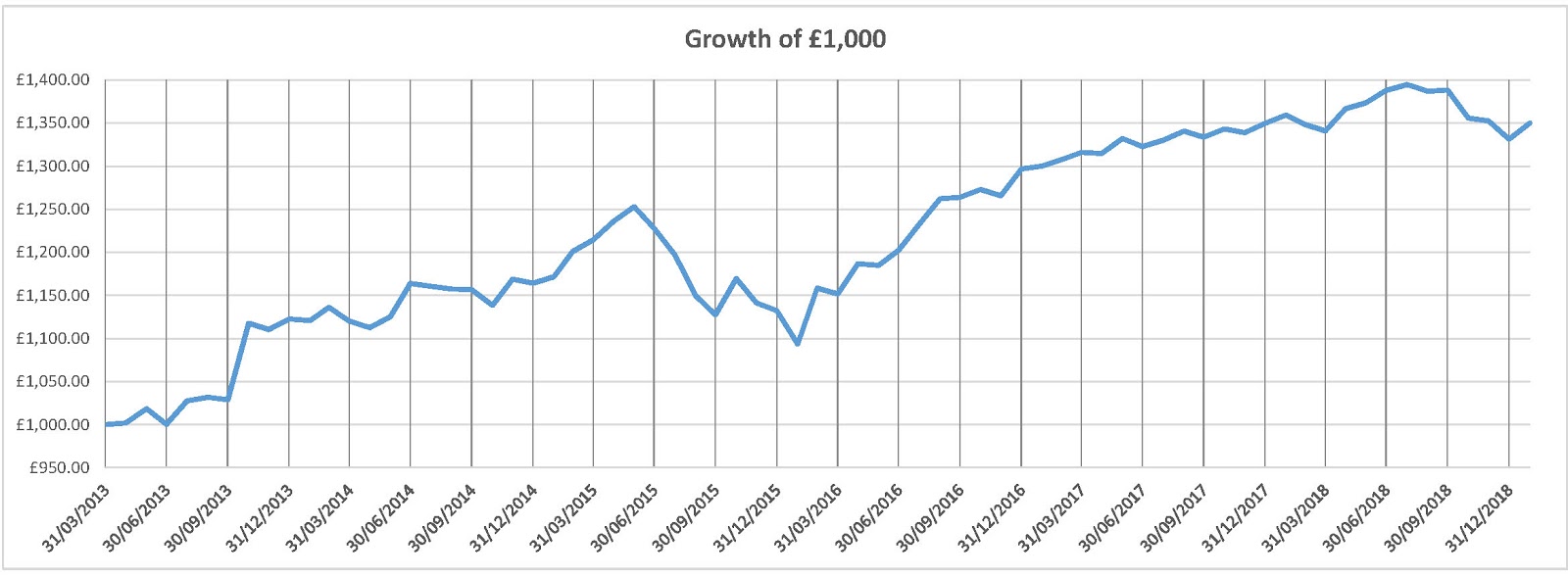
Here's the summary data from my attempt (click on them for larger images) :-

And the annualised returns :-

By default, the nominal growth curve displayed is set up using an initial US$10,000 value, but it can be changed easily enough. I set mine as £1,000 although you can make it anything you like, or I'm sure it could also be formatted as percentages.
I also added an extra worksheet myself, and pulled in the calculated data to make a 'Heat Map' of monthly returns over the years. You'll need to be reasonably familiar with Excel to set up the conditional formatting to display the colour gradations, but it's not too difficult.

All in all, an interesting exercise using free resources which are quite intuitive to follow, and it provides an alternative to manual unitisation of your portfolio.
However, as the ermine pointed out recently, tracking your returns in any format really shows up how crap you're actually doing !
No comments:
Post a Comment